Sharper full-width images in Arc
Arc has been my default browser for close to two years, and while it’s generally great, full-width images often don’t look as sharp in Arc as they do in other browsers.
Some context on responsive images
Working with responsive images typically involves generating multiple sizes of a source asset and referencing them in a srcset attribute or <picture> element.
When using srcset with an <img> tag, we use the sizes attribute to define the width an image will take up at various viewports, which allows the browser to determine the best file to download for that context:
<img
  srcset="dog-small.jpg 390w, dog-medium.jpg 640w"
  sizes="(max-width: 640px) 100vw, 640px"
  src="dog-medium.jpg"
  alt="Good dog"
/>
In this example, we’re referencing two files:
dog-small.jpgwith a width of390pxdog-medium.jpgwith a width of640px
In the sizes attribute, we’re telling the browser that if the viewport is less than or equal to 640px, the image will take up the entirety of the viewport width.
If the viewport is larger than 640px, the image will still just be 640px—implying that it (or a parent element) is constrained with an explicit width or max-width of 640px.
Using a <picture> element is similar, but allows the developer to explicitly state which asset should be displayed under what conditions using media queries. This is useful if an image has different crops or aspect ratios at different viewports:
<picture>
  <source media="(max-width: 639px)" srcset="dog-small-square.jpg" />
  <source media="(min-width: 640px)" srcset="dog-medium-wide.jpg" />
  <img src="dog-medium-wide.jpg" alt="Good dog" />
</picture>
In either case, figuring out the best asset sizes to generate is easy when the image is rendered within a known layout, but what about fluid, full-width images?
Resolutions to supply for full-width images
The top five viewport widths visiting this site in the last year were 390px, 1366px, 1920px, 2560px and 1280px1—so a logical list of image variants to generate for this site could be those five, as well as @2x versions for high pixel density displays:
[390, 780, 1280, 1366, 1920, 2560, 2732, 3840, 5120]
Screen width is not necessarily the same as browser width, but this is a reasonable starting point—and there are far fewer unique browser widths than browser resolutions (width × height).
Thankfully laptop/desktop-class devices have not suffered the same degree of divergent screen sizes that mobile devices have; e.g. the 5k iMac—released 10 years ago—has the exact same resolution as the Apple Studio Display that’s sold today. When this site first supported responsive images 12 years ago, half of the image variants I was generating then are still just as relevant now.
Why this matters in Arc
Modern web browsers allow content to extend to the left and right bounds of the app window, but Arc does not—its application frame takes up 10px of space on either side.
Because of Arc’s uncommon application frame, its viewport may never match the asset widths many responsive images are optimized for, and this subtle difference can result in suboptimal scaling.
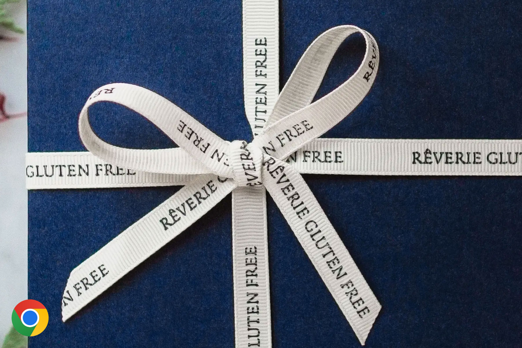
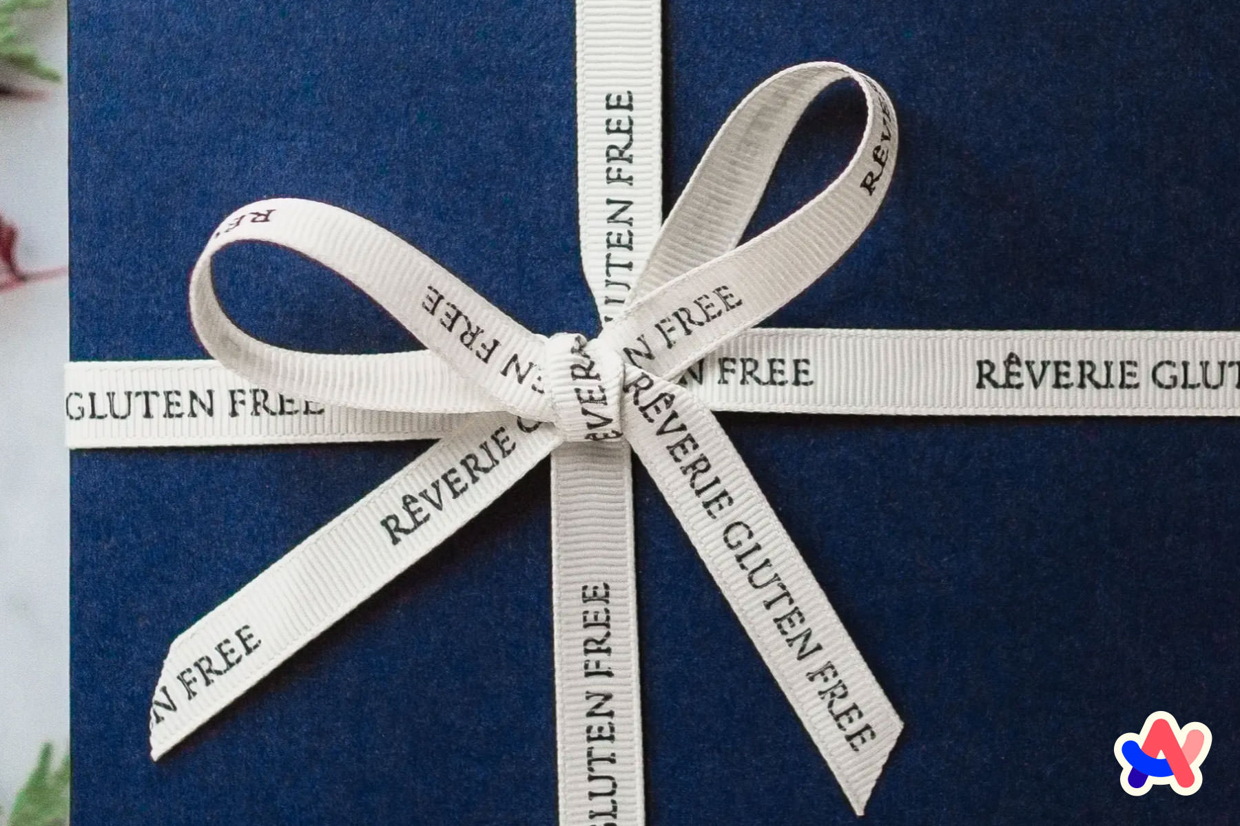
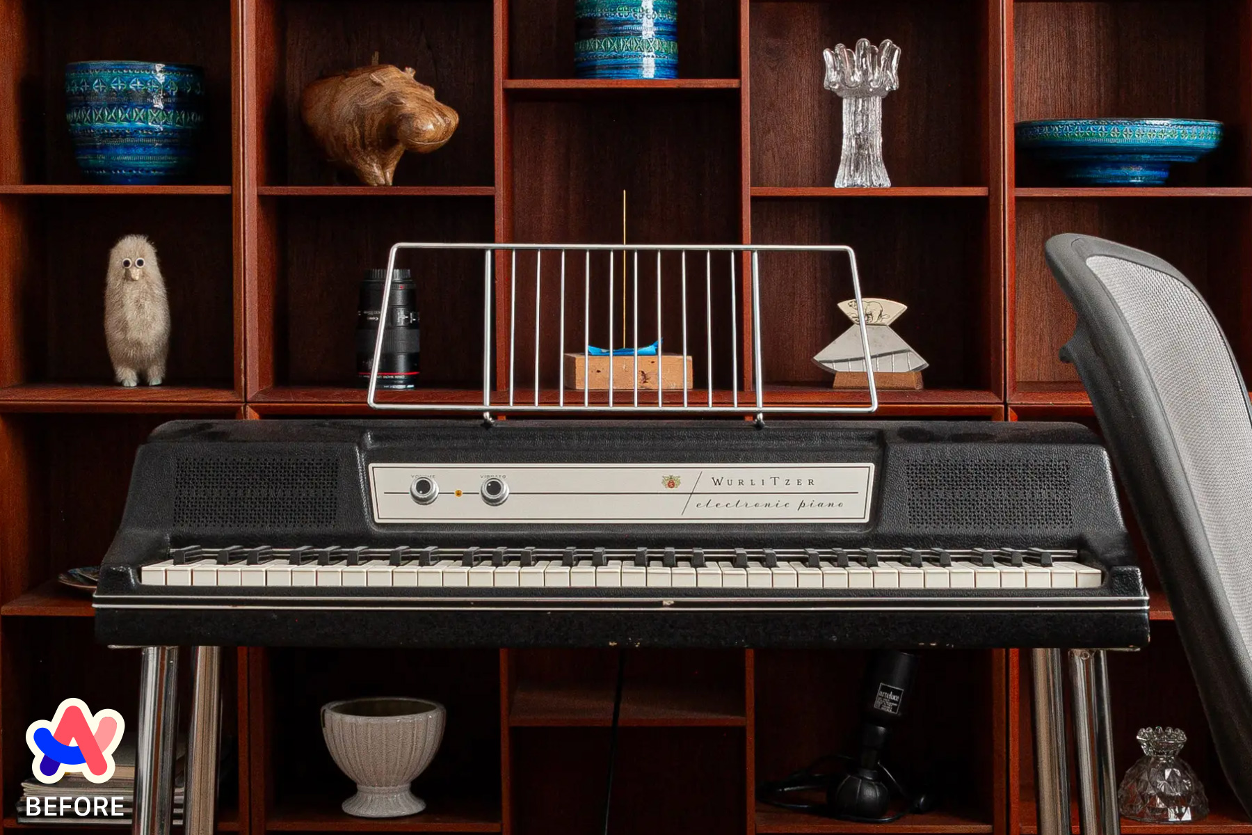
The concept here is similar to pixel fitting; when an image is rendered at its exact natural dimensions—or an even multiple thereof—it will appear sharper than if it is scaled, because the browser is not required to interpolate fractional pixels.
Example
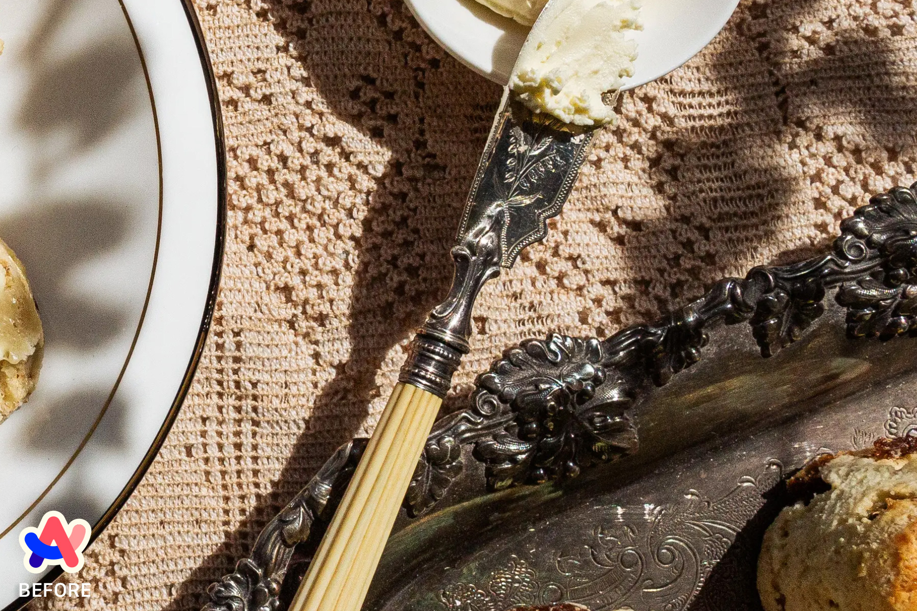
Consider a full-width browser window on a newer 13” MacBook Air.
Chrome and Safari2 recognize a 1280px viewport with a pixel density of 2, download the 2560px asset, and render it perfectly sharp at an even 2:1 scale.
In Arc however, the viewport is not 1280px—but rather 1260px. The browser will still download the 2560px asset (as it’s the closest to 1260px @2x), but instead of a perfect 2:1 scale, it renders at 2.03174603175:1—which appears less sharp.
What can be done?
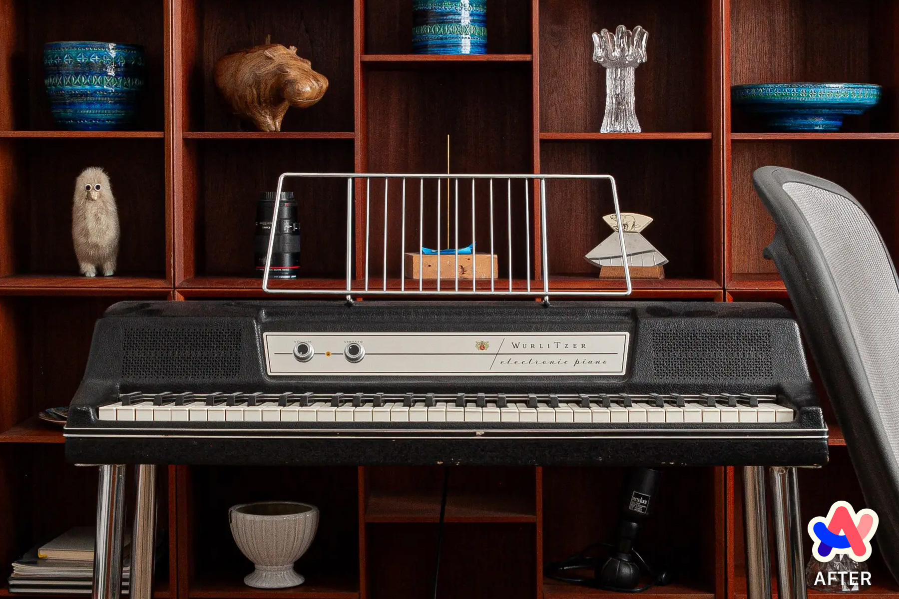
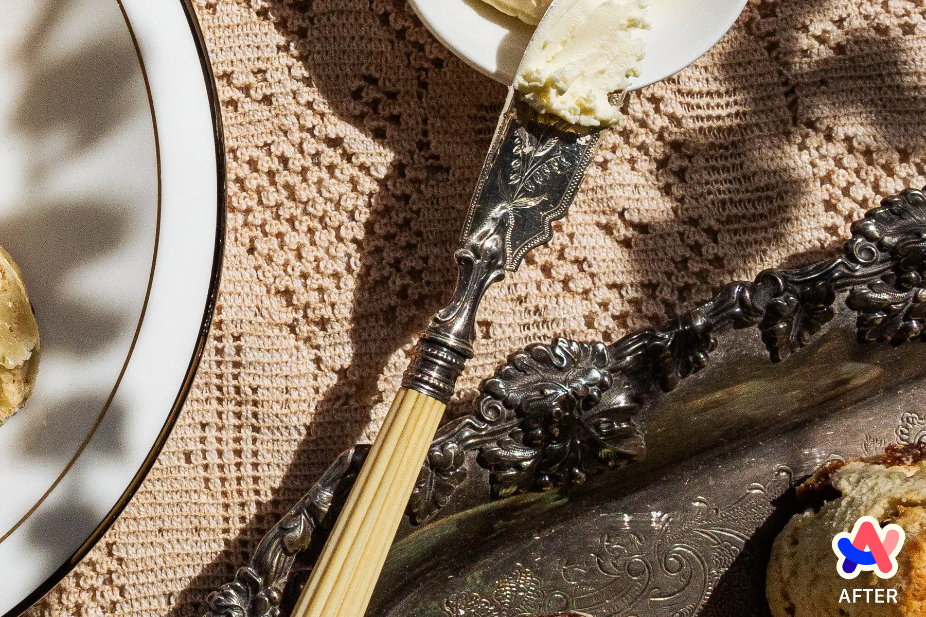
There are a few different ways to ensure more users see sharper full-width images in Arc, but the simplest approach is to apply Arc-specific styles to offset its frame width.
This still requires an exact asset/viewport match to render optimal sharpness, but by offsetting Arc’s border we greatly increase the odds of this happening.
Pt. I: Detecting Arc
Like Chrome, Arc is built on Chromium—so navigator.userAgent can’t be used to differentiate it. This answer on Stack Overflow suggests detecting Arc by checking if the CSS custom properties it uses for theming are defined—which, while hacky—works well:
window
  .getComputedStyle(document.documentElement)
  .getPropertyValue('--arc-palette-title');

// Returns hex color (e.g. '#FAFAFAFA') if defined, empty string if not
To harden this approach we can:
- Hedge against our script executing before Arc’s UA stylesheet
- Check more than one of Arc’s custom properties in case names have changed
- Persist the result in
localStorageto avoid checking again on subsequent sessions - Add a class to
<body>that can be used to target Arc-specific styles
Here’s what that looks like:
function addArcClassToBody() {
  document.body.classList.add('js-browser-arc');
}

function attemptToDetectArcTheme() {
  const MAX_ATTEMPTS = 3;

  // Some of the CSS custom properties Arc uses in its UA stylesheet
  const PROPERTIES = [
    '--arc-palette-title',
    '--arc-palette-subtitle',
    '--arc-palette-background',
  ];

  // Counter
  let attempt = 0;

  // Minimum amount of time to wait for Arc's stylesheet
  let interval = 50;

  function tryDetect() {
    const isArc = PROPERTIES.some((property) => {
      return (
        window
          .getComputedStyle(document.documentElement)
          .getPropertyValue(property) !== ""
      );
    });

    if (isArc) {
      addArcClassToBody();
      localStorage.setItem('BROWSER', 'ARC');
      return;
    } else if (attempt >= MAX_ATTEMPTS) {
      // Use this to tell future sessions we've checked already; !isArc
      localStorage.setItem('BROWSER', 'OTHER');
      return;
    }

    attempt++;

    // Check after minimal delay, then increase wait (50ms, 100ms, 300ms)
    interval *= attempt;
    setTimeout(tryDetect, interval);
  }

  tryDetect();
}

const browser = localStorage.getItem('BROWSER');

if (browser === 'ARC') {
  addArcClassToBody();
  } else if (!browser) {
  attemptToDetectArcTheme();
}

// Implicit case: if `browser` already exists, but is not 'ARC', do nothing
Now Arc users will have class .js-browser-arc on <body>:
<body class="js-browser-arc">
  <!-- content -->
</body>
Pt. II: Arc-specific styles
In the :root of our styles, we’ll set a CSS custom property for Arc’s border (i.e. app frame) width. That way if it changes in the future, there’s just a single value to update:
:root {
  --arcBorderWidth: 10px;
}
Then we simply need to modify the width of full-width images/image containers to take Arc’s border width into account, and adjust their margin so that they remain centred:
.js-browser-arc .Hero {
  margin-left: calc(var(--arcBorderWidth) * -1); /* -10px */
  width: calc(100% + var(--arcBorderWidth) * 2); /* calc(100% + 20px) */
}
Finally, if a user is browsing with Arc in fullscreen mode, then there is no application frame to offset—so we should exclude this case with a media query:
/* No application frame in fullscreen mode, so no need to work around it */
@media not (display-mode: fullscreen) {
  .js-browser-arc .Hero {
    margin-left: calc(-1 * var(--arcBorderWidth)); /* -10px */
    width: calc(100% + var(--arcBorderWidth) * 2); /* calc(100% + 20px) */
  }
}
And with that, more users should see sharper full-width images in Arc.
Alternate methods
Generate n - 20px image variants at build time
If we’re generating asset variants at build time, we could add n - 20px to the list of resolutions. This might work for small sites, but it will increase build time and storage resources significantly in non-trivial use cases.
// ✋ Not recommended

// Original
[1280, 2560]

// Original and (n - 20px), (n - 20px) @2x
[1280, 1260, 2560, 2520]
Use on-demand image service to dynamically request exact assets
Services like Imgix and Cloudinary support on-demand image transforms, so we could use client-side JavaScript to detect the user’s viewport and pixel density, and use that to request a perfectly-sized asset for every user. This will have the highest hit rate of perfectly-sized assets, but it’s also the slowest, least scalable, and most expensive due to a potentially extreme number of image transforms.
// ✋ Not recommended

// Get viewport
const viewport = window.innerWidth;
const density = window.devicePixelRatio;

// Request perfectly-sized asset on-demand
<img src={`https://assets.imgix.net/dog.jpg?w=${viewport * density}`} />
Footnotes
-
This maps to Statista’s report on screen resolutions used worldwide in 2023 ↩
-
Fractional/imperfect scaling is less of an issue in Safari; Webkit has better sub-pixel interpolation than Chromium ↩