Designing a home
From 2017-2018, my wife and I had our home renovated. I designed the space, and we had a design-minded builder execute the work.
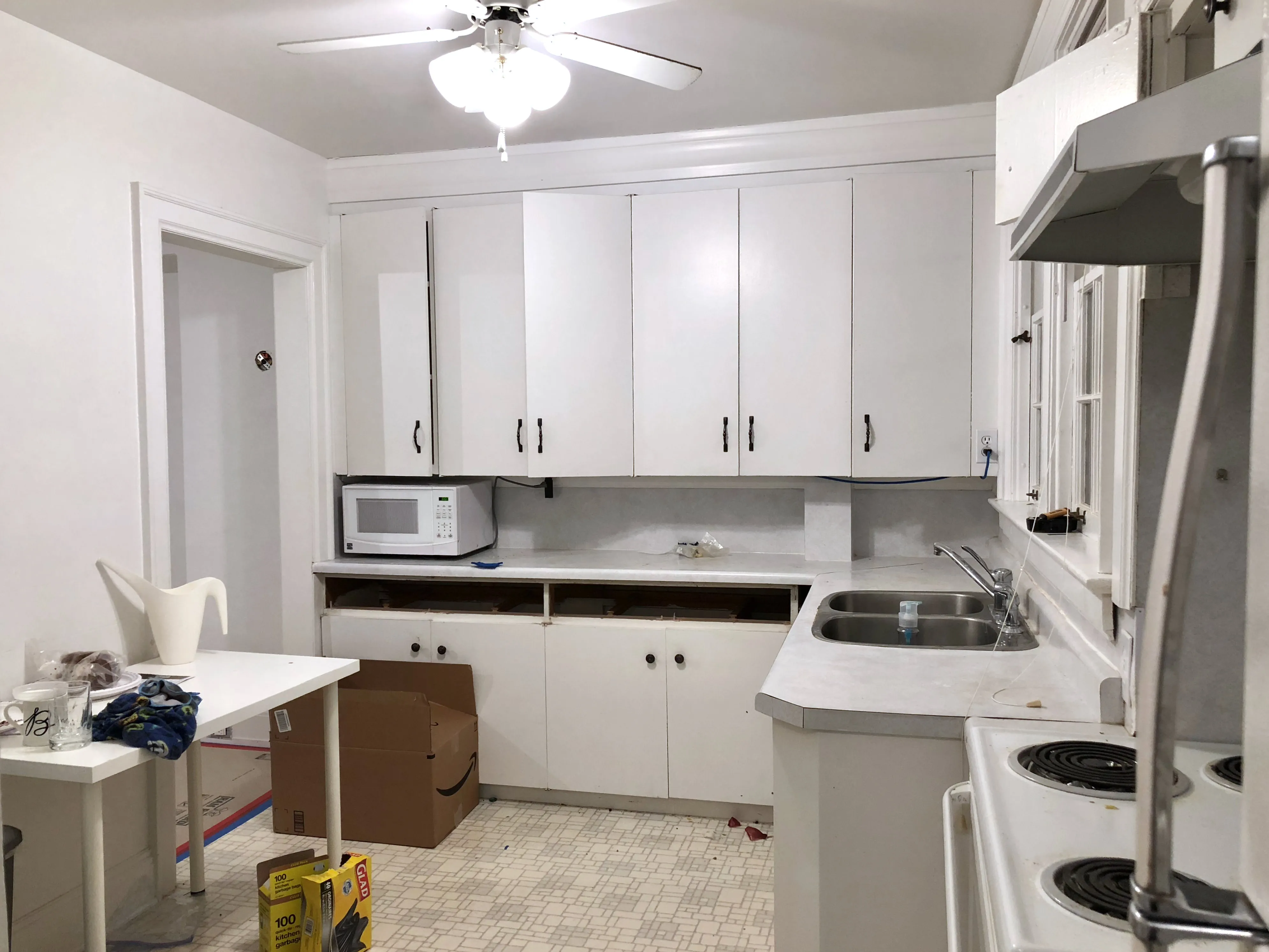
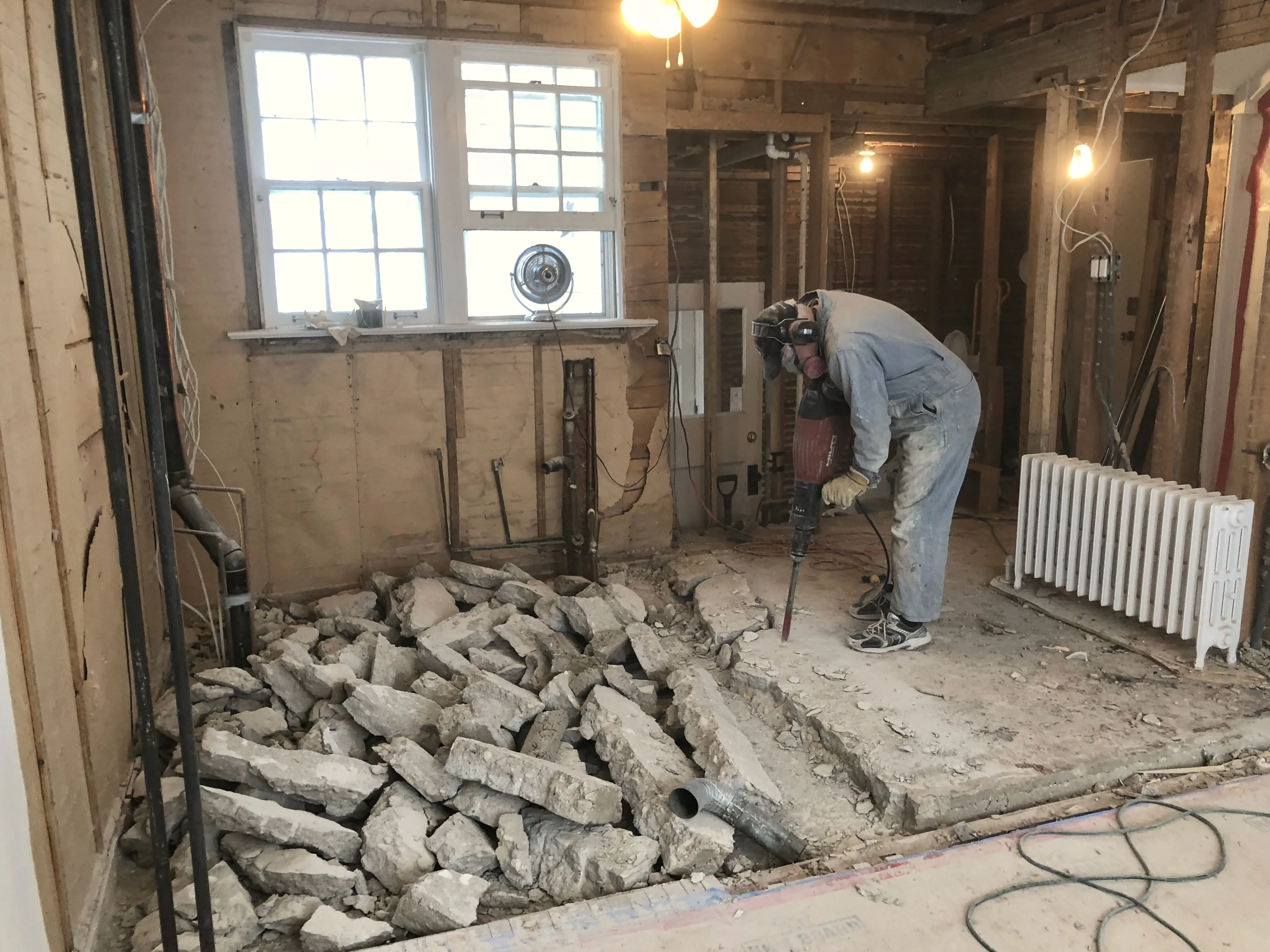
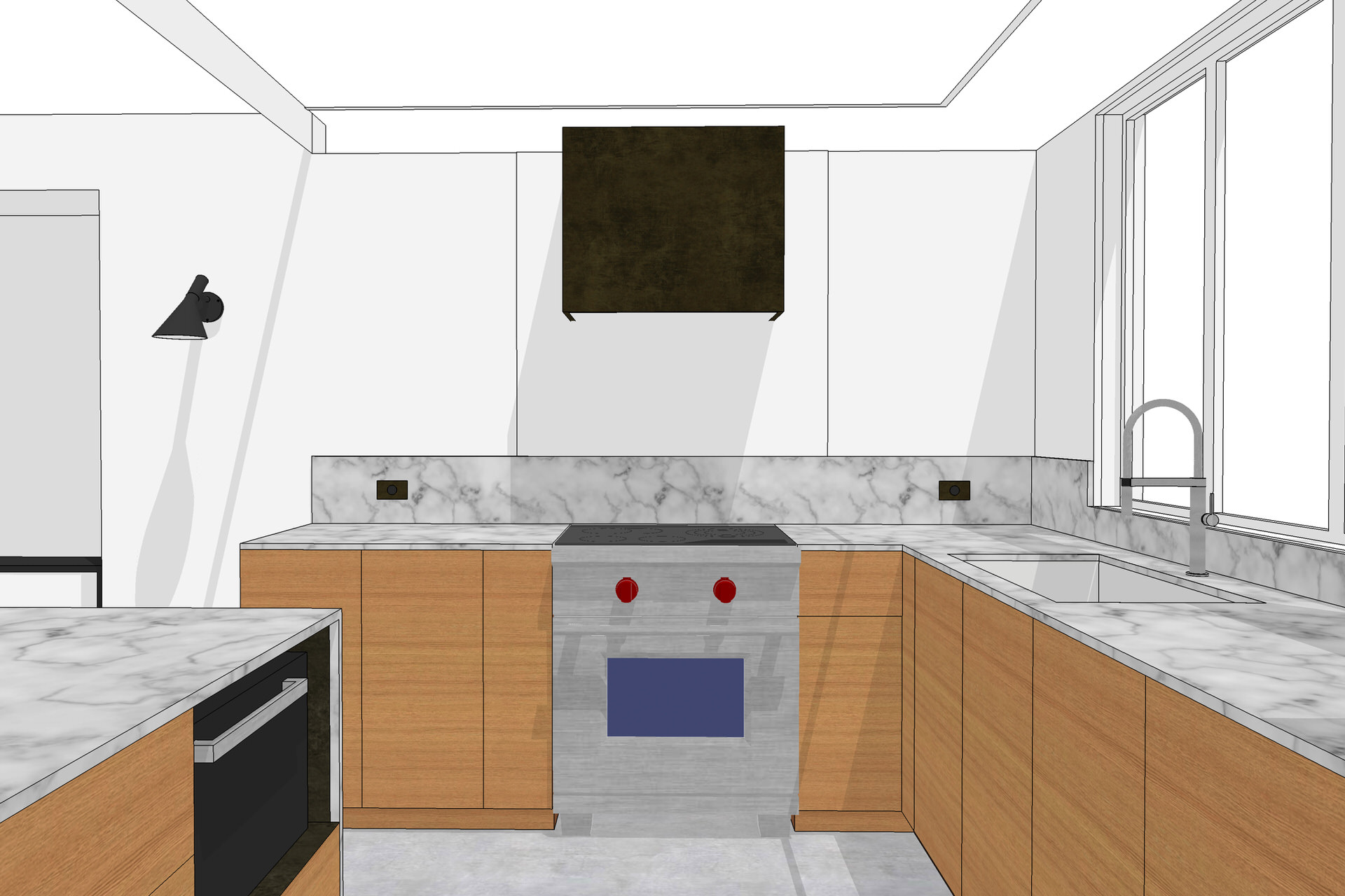
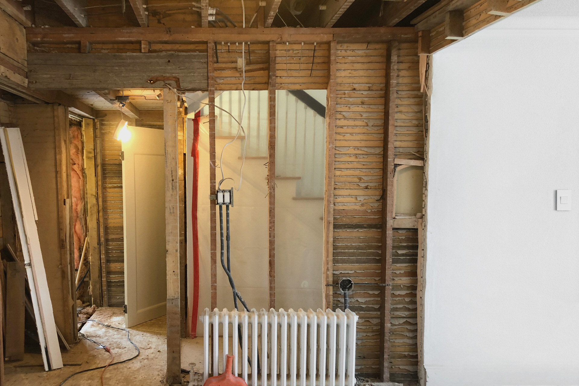
A friend had introduced me to SketchUp, and helped with some initial models of the space. Using these files as a starting point, I spent several months iterating on the design with increasing fidelity, revisiting the process as constraints emerged through demolition. Our house is close to 100 years old, and any renovation—especially in an old house—is bound for surprises.
Working in 3D allowed me to more carefully consider the spaces and sightlines than a typical plan or one-off render. Using a friend’s VR rig, I walked through the models to better understand flow and utility. Many of the fixtures and appliances considered had 3D models available, so I was able to audition them in the space before making a commitment. When options were presented during the construction, I was able to model each permutation to better understand it in context, rather than rush a decision or leave it solely to the builder. It also helped immensely that the builder was comfortable with SketchUp, so I could send ideas over for them to assess feasibility. In the end, the build came remarkably close to the model.
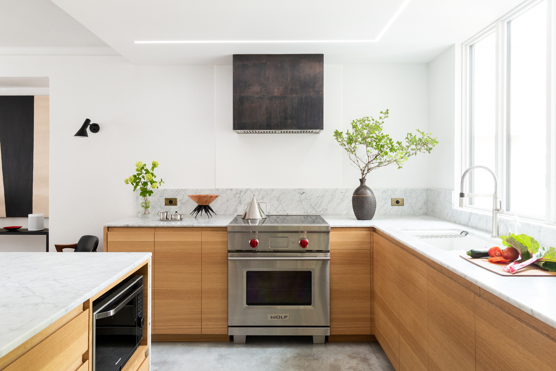
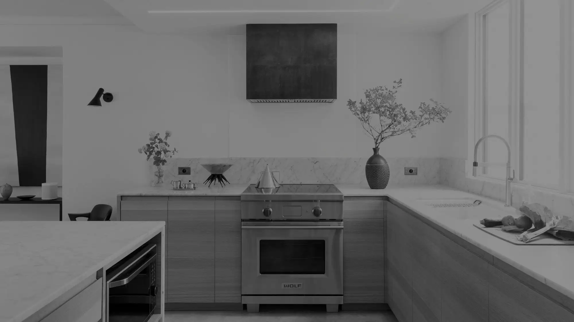
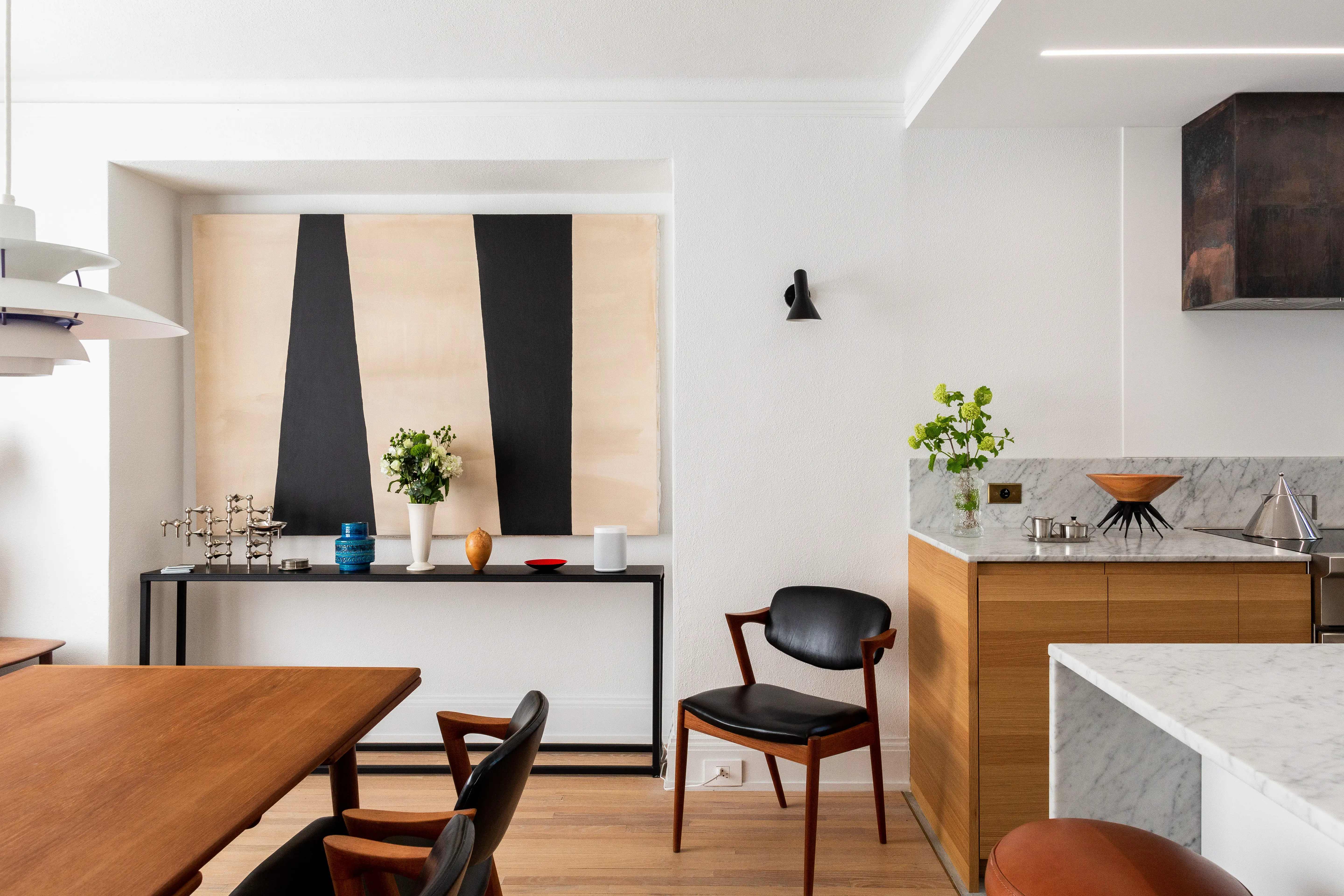
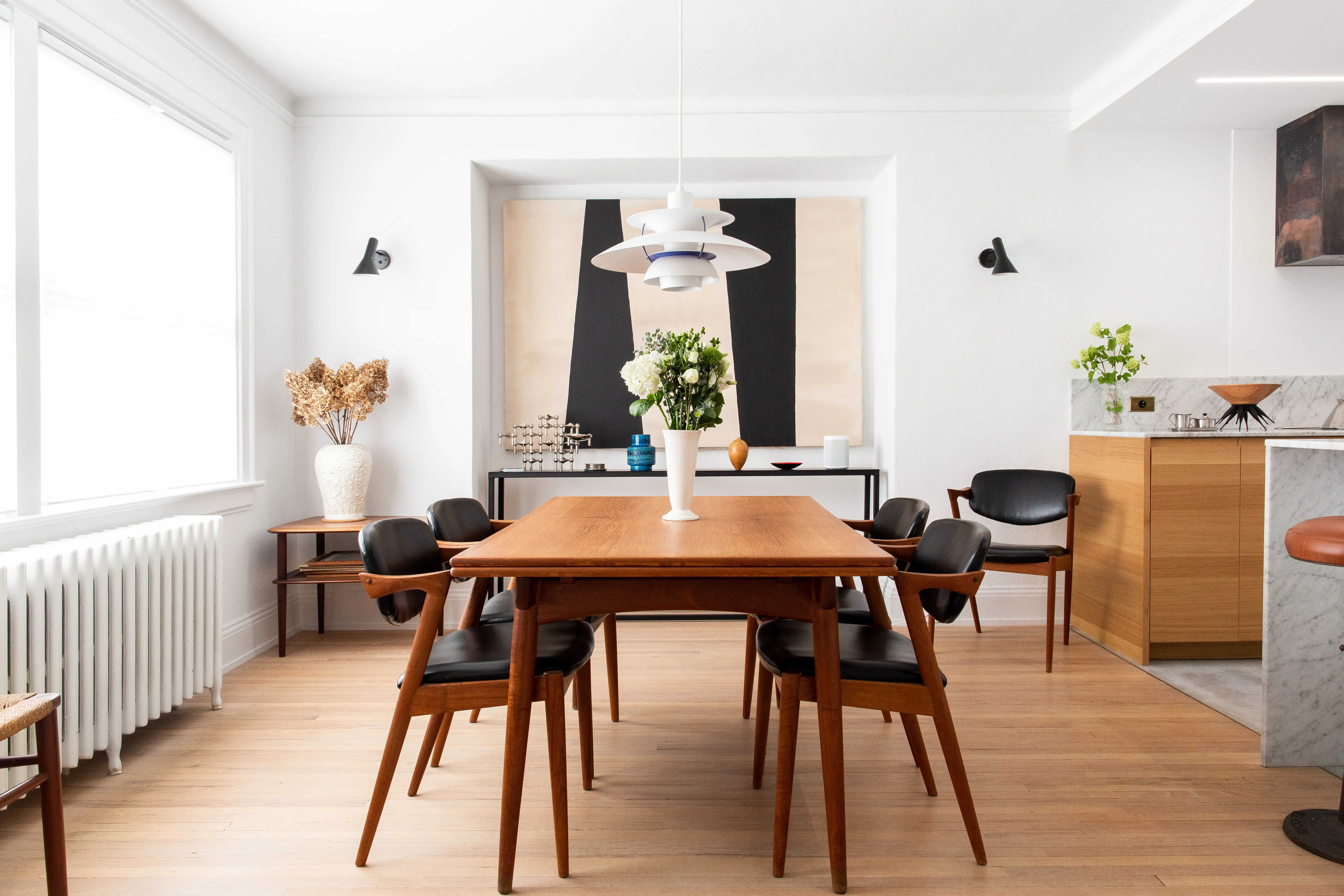
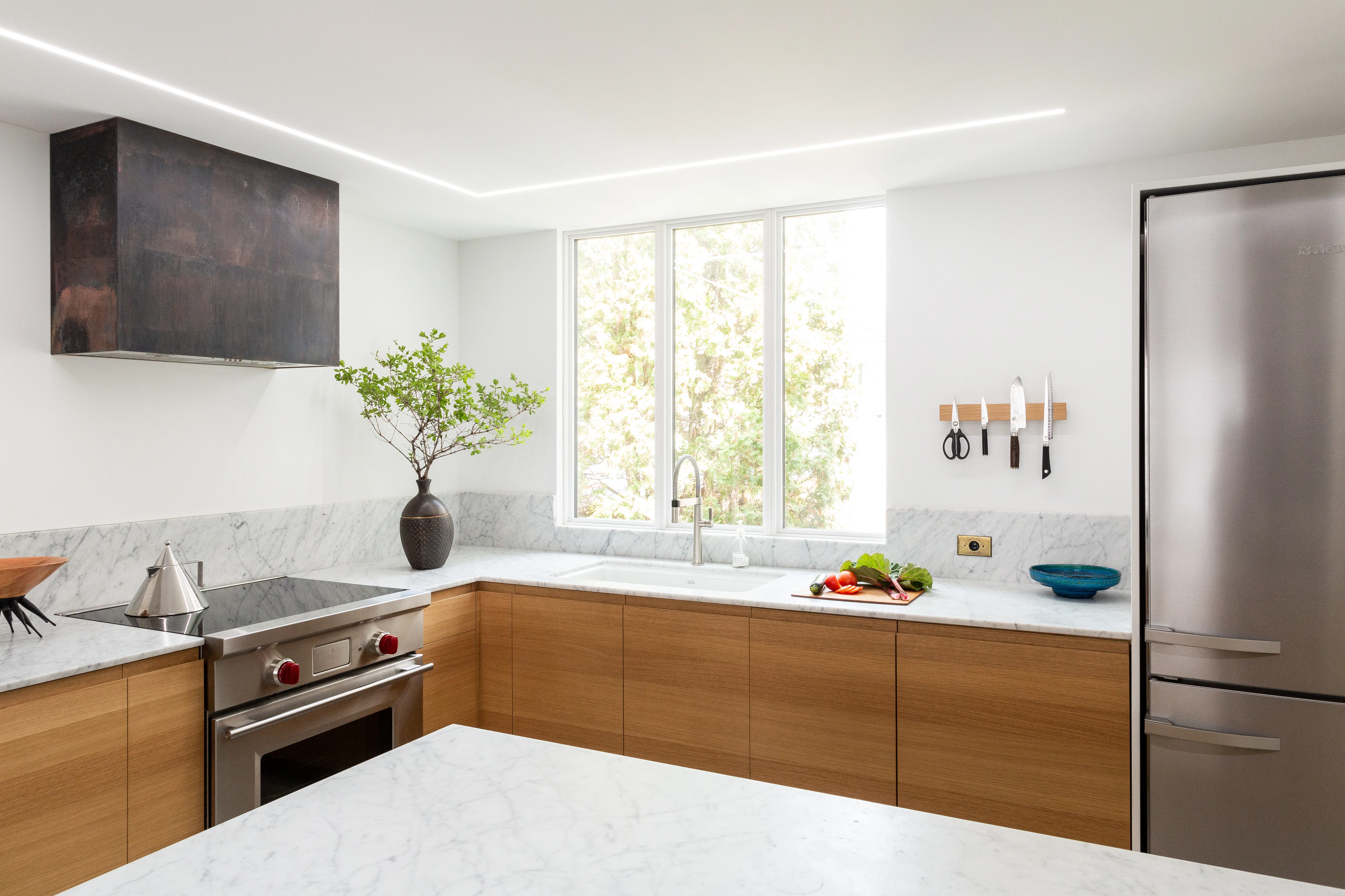
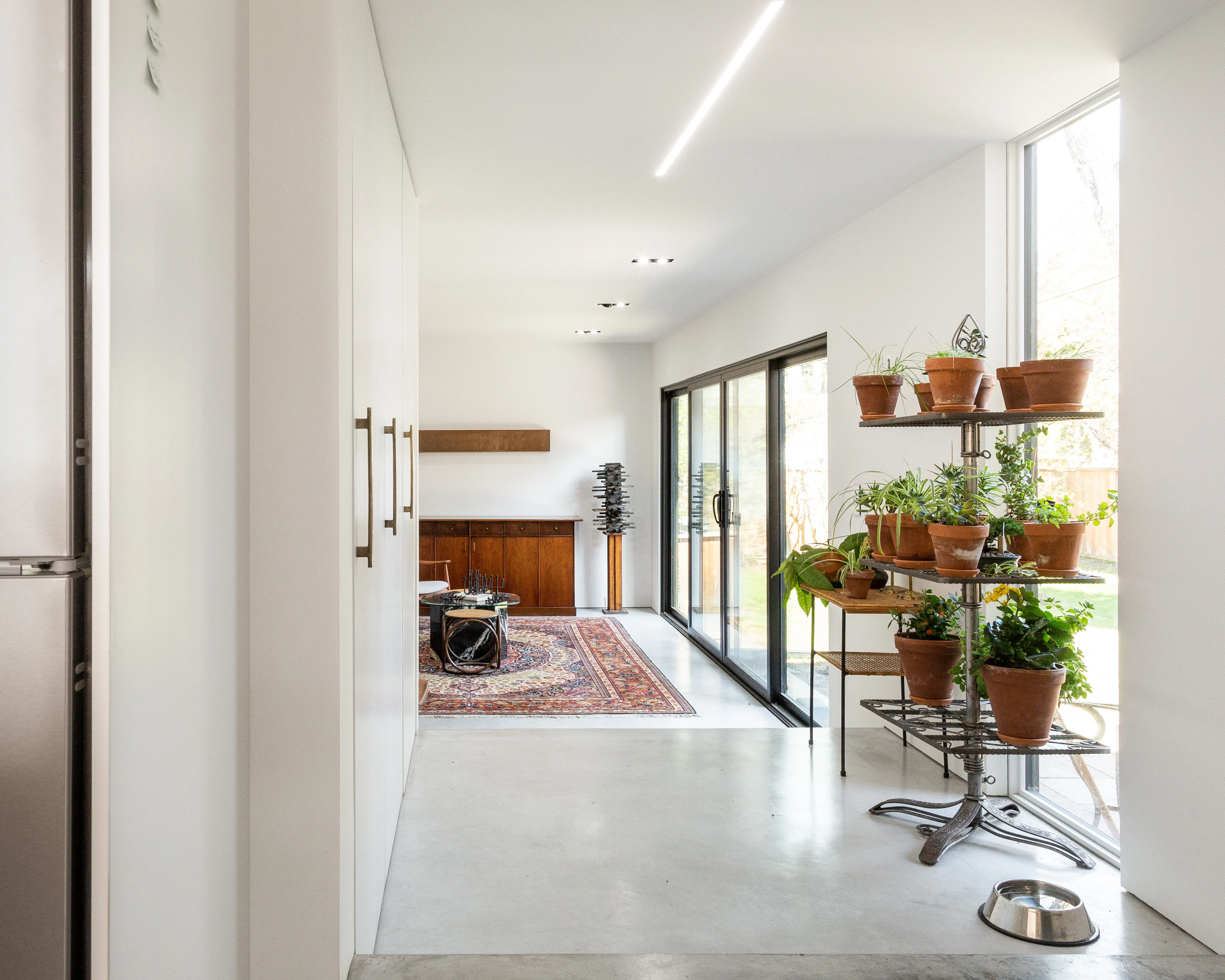
The final design attempts to blend old with new, and mixes modern lines with natural materials. This was the first space I’ve designed, but I found the principles familiar to what I knew in other disciplines, and learned a lot about the process along the way. I go into more detail about a few of my favourite features below.
Lighting
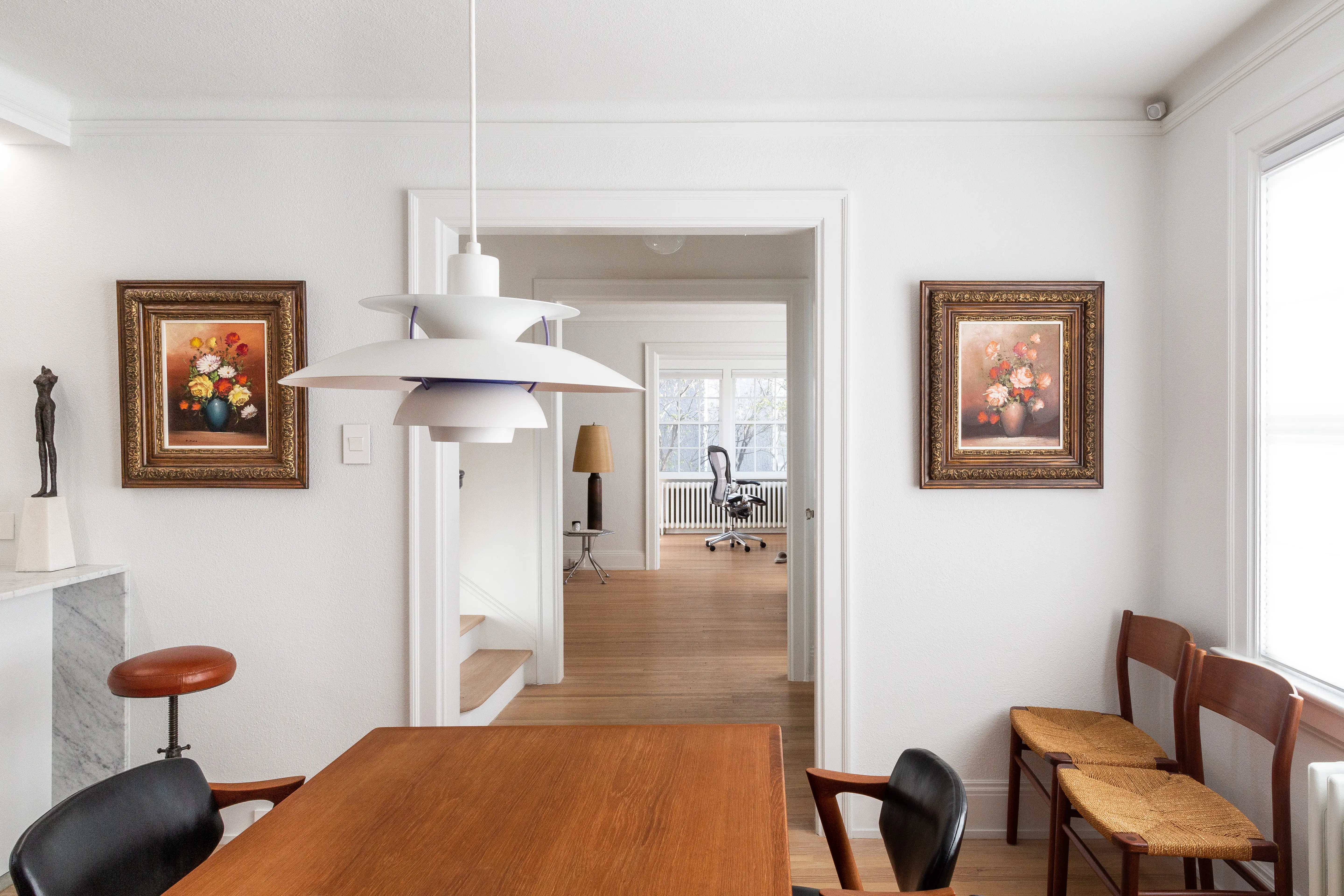
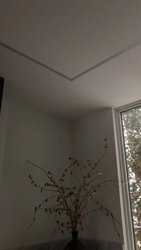
In continuing the mix of old and new, I integrated Danish lighting from the 1950s in the dining room, and custom-made modern linear lighting in the kitchen.
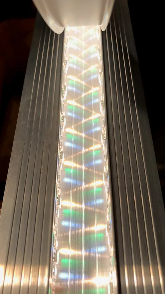
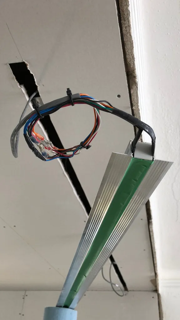
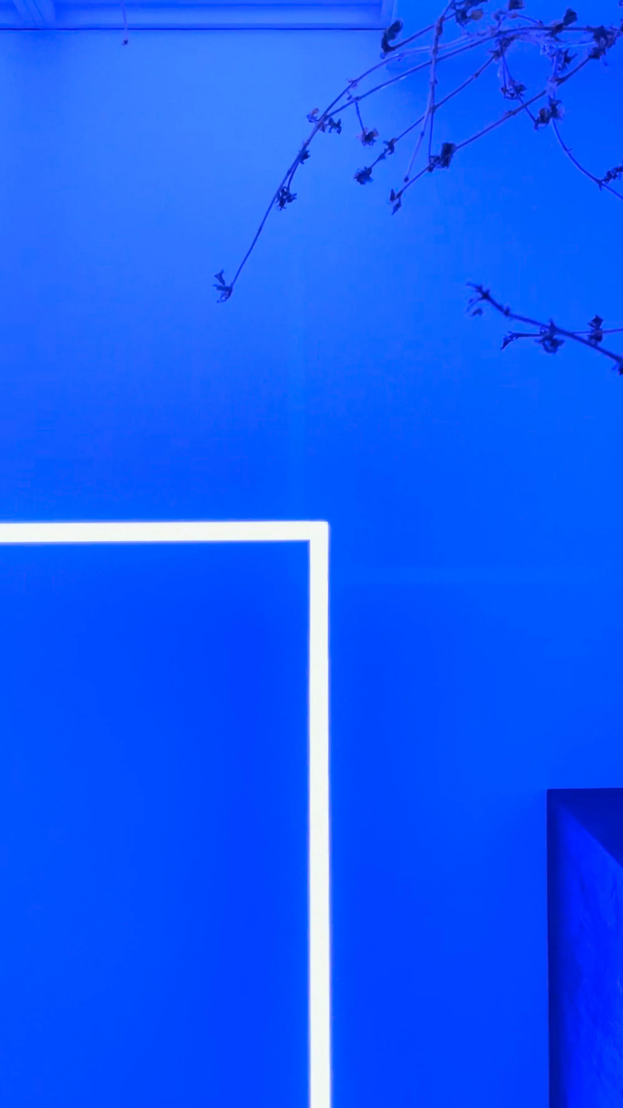
The linear lights consist of flush-mount aluminum channels with diffusers, five-channel LED strips1 colour-matched to Philips Hue, dual PWM2 amplifiers (RGB and tunable white), Philips Hue LS+ controllers, and commercial power supplies.
In order to eliminate hotspots, I ran two light strips along the side walls of the aluminium channels, and created an offset for consistent spacing between CW•RGB•WW3 diode clusters. In testing several methods of mounting and diffusion, I found this approach to be the best balance of heat dissipation and output.
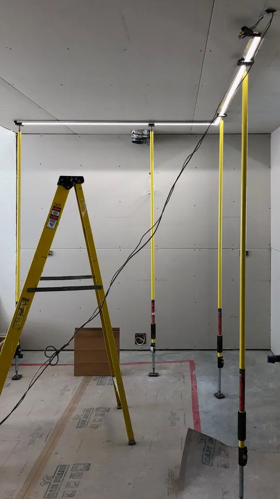
For each fixture, I had an electrician run a standard line-voltage light switch to a junction box near the electrical panel in the basement, and low voltage wire from there back up to its respective installation location. Downstairs, I connected each switched line to a 24V power supply that feeds a Philips Hue LS+ controller and two PWM amplifiers that power the fixture.
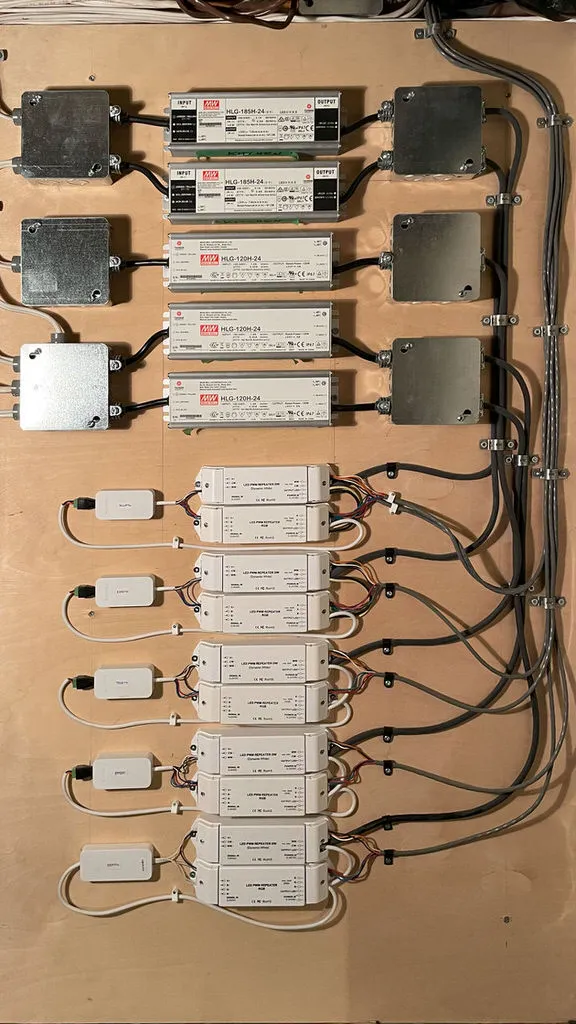
In total I built five discrete lights; each addressable individually or by group from the Philips Hue app or any voice assistant. All of them work seamlessly with standard in-wall switches to match the rest of the house.
In terms of brightness, at peak output the three fixtures in the kitchen are capable of roughly 23,400 lm at 4200k, with a CRI of 95+. This equates to approximately 29 standard 60W light bulbs or 78(!) Philips Hue GU10s. A (desired) side effect of having this much available light is that in practice, the fixtures are rarely over 50% power, which should extend the lifespan of the LEDs considerably.
Hide and seek
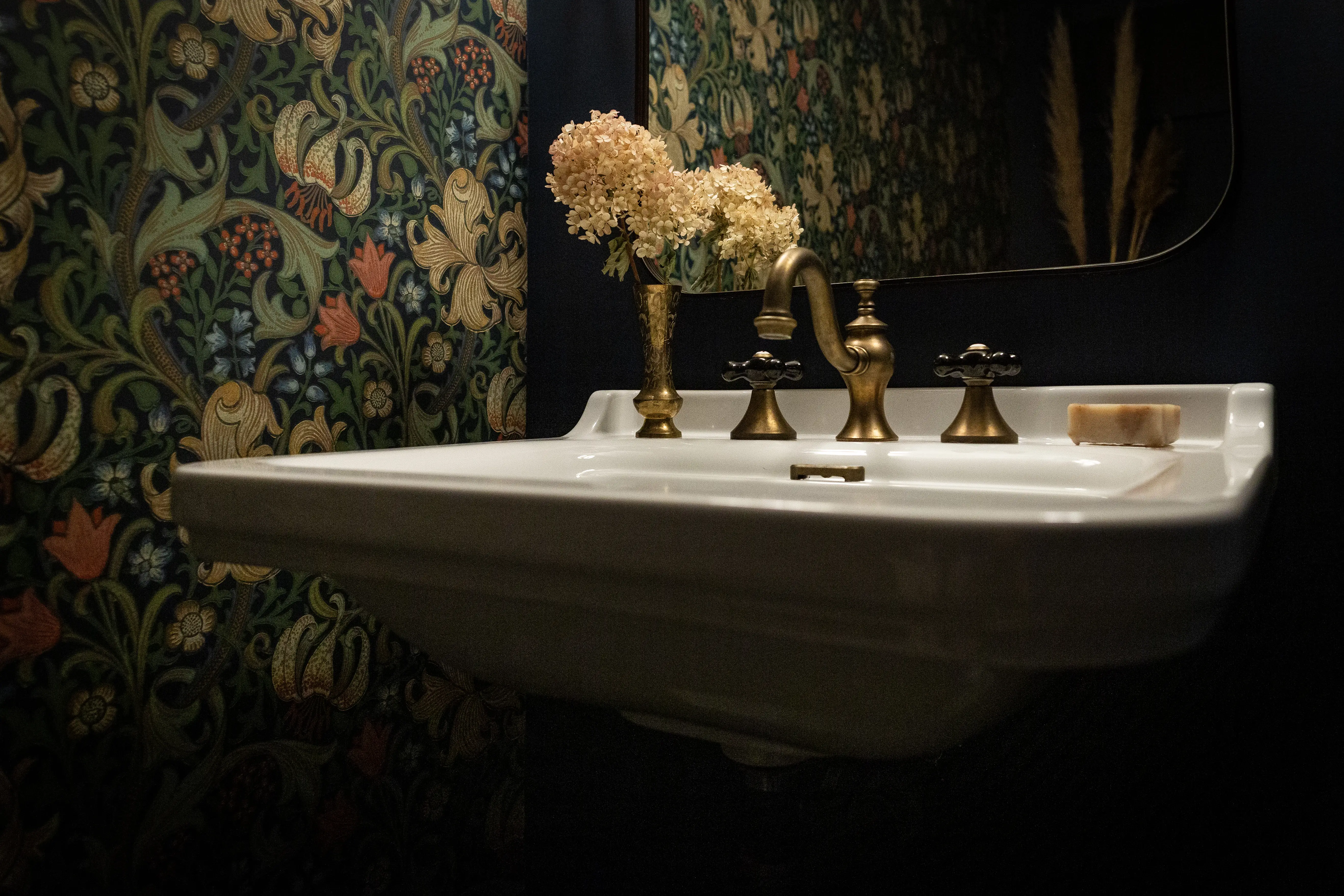
Towards the back of the house, there is a bank of three full-height cabinets on the north wall. Behind the first door is a pantry, framed in baltic birch with adjustable shelves. The third door is more storage, mostly for cleaning and dog supplies. The centre door opens to a T-shaped powder room hidden behind the other cabinets.
I painted the powder room a deep navy, in contrast to the otherwise bright house. A feature wall has floor-to-ceiling period appropriate wallpaper by William Morris, in a pattern called Golden Lily4.
I had a friend sandblast chrome bathroom fixtures to reveal the raw brass underneath, and treated them with an acid mixture to accelerate patina into cohesion with other original fixtures in the house.
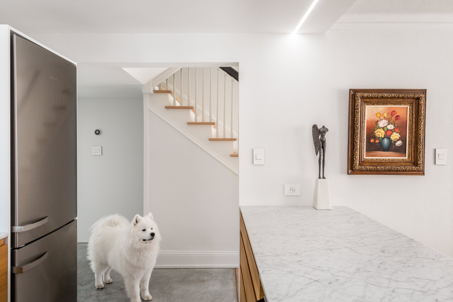
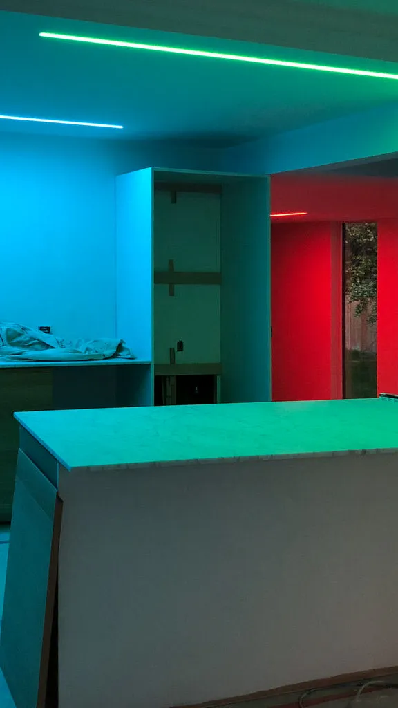
When the powder room door opens, a ZigBee-enabled reed switch communicates with Home Assistant running on a Raspberry Pi to turn the lights on. If we’re entertaining, the linear fixture outside the door can turn into an airplane-style occupancy indicator, turning red when occupied and green when available.
Footnotes
-
The lightstrips are called Bifröst and made by a company called Sowilo DS. I was one of their first customers, and Mike from Sowilo was immensely helpful throughout this process. ↩
-
PWM stands for Pulse Width Modulation. ↩
-
CW•RGB•WW stands for Cool White, Red, Green, Blue, and Warm White. With the strips I used, the cool white diode is 6500k, and the warm white is 2200k. ↩
-
If you’ve seen Sex Education on Netflix, Dr. Jean Milburn (Otis’ mum) has this same wallpaper along with other William Morris patterns throughout her house. William Morris was a pioneer of the Arts and Crafts movement. ↩