Herman Miller Lifework
This interview was originally conducted by Amy Feezor for Herman Miller’s now-defunct “Lifework” blog. Apartment Therapy also published the piece.
Tell us about yourself and your work: what you’re passionate about, what inspires you, and where you’re going.
I focus on responsive, future-friendly, front-end design and development. This means I design and code websites that flex and adapt to the device the user is viewing them on. Progressive enhancement ensures that users visiting a site from their phone on a congested mobile network aren’t forced to download the same site assets they would see on their 30″ display at the office. Future-friendly development means writing flexible, modular code structure that is mindful of what’s next in tech.
I’m inspired by quality craft, regardless of medium. It is endearing to witness a maker who is good at what he or she is making. I’m also inspired by my city and the people who call it home. Winnipeg has an incredibly rich arts and cultural scene, especially for a city of relatively small size. In the past few years our downtown has seen some really cool architectural installations, like a huge steel/LED sculpture called “Emptyful” that’s shaped like an Erlenmeyer flask, and OMS Stage, an open-air performing arts venue that looks like it’s straight out of a science-fiction movie. When the rivers freeze in the winter, we clear the longest skating trail in the world and line it with warming huts designed in an annual architectural competition. I think there’s something to be said for the resilience and outward thinking this city embraces.
Tell us about your space. What’s your aesthetic? What do you like or dislike?
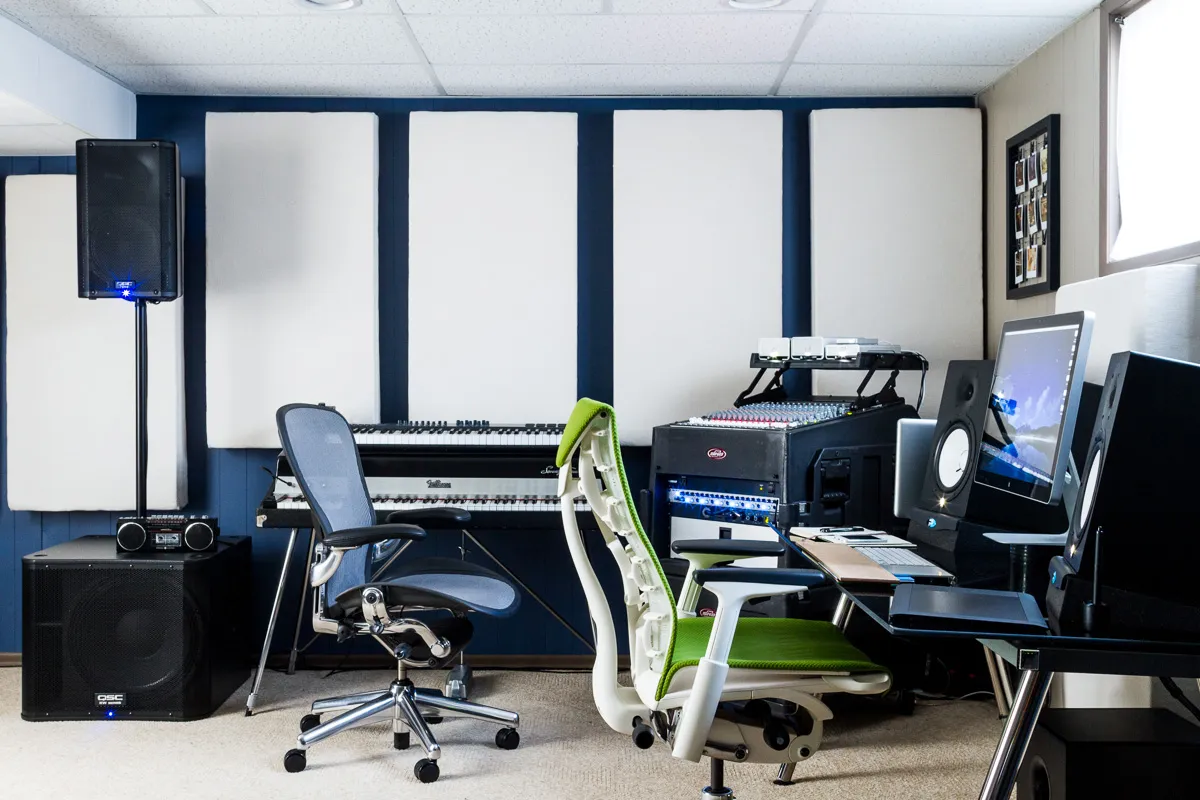
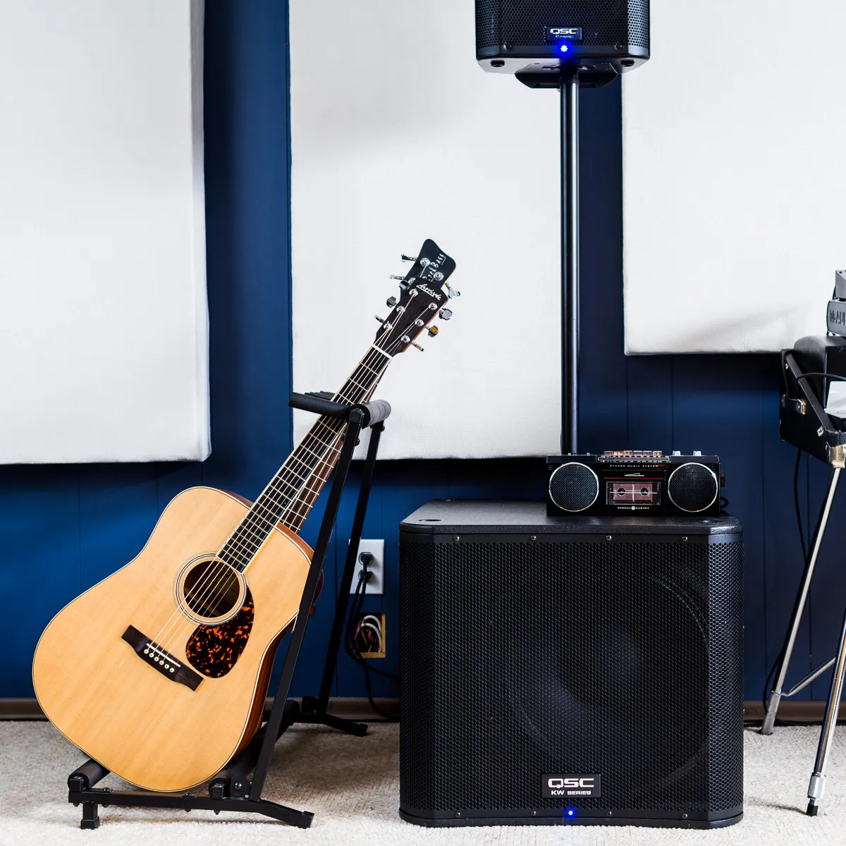
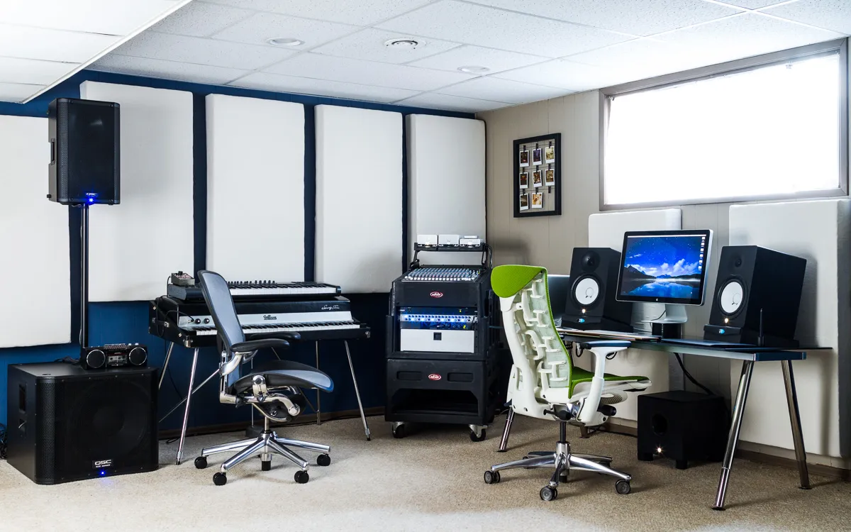
My space is a bit of an audio playground, with instruments and recording gear and a life-size cardboard cutout of Raj Koothrappali from the TV show ”Big Bang Theory” (he’s camera shy). I have a flawless Fender Rhodes piano that was built in March of 1972, and will forever be the coolest thing I own.
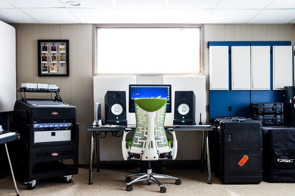
The studio monitors on my desk sit on foam/steel wedges that isolate the speaker vibrations from my work surface. These are my go-to for listening to most music, but if I’m listening to a concert recording I’ll also bring up the mono speaker stack for a different timbre. If I’m listening to something with poor quality sound, I’ll route the audio through an old GE stereo I modded a few years ago that can plug directly into my mixer. This is kind of like the aural equivalent of taking a mediocre picture of your feet with Instagram and applying a filter to make it “better.”
The big white pillow things on my walls are broadband absorbers that help eliminate sound reflections and frequency nodes. Each panel is 4″ of rigid fiberglass insulation and an open wood frame that is wrapped in fabric and hung with picture frame wire.
My window treatment (if I can even call it that) is several layers of translucent plastic tablecloth, held in place with binder clips and magnets. It turns my basement window well into a big softbox. When rabbits hop in the garden above it’s like a shadow puppet show without the puppets.
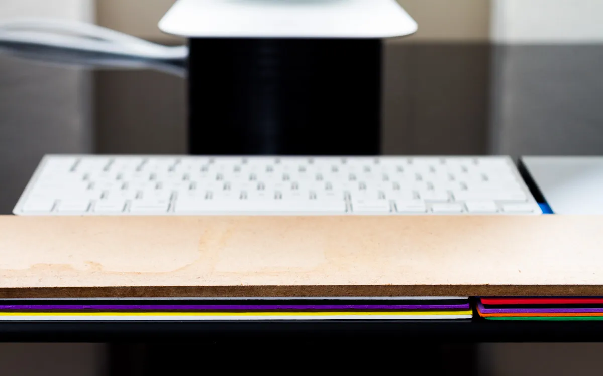
I’m constantly exploring ergonomics, and love finding new ways to make working better. Currently my wrists rest on a water-damaged piece of hardboard from an old drawer. This sits atop a stack of dollar-store craft foam that raises the leading edge of my keyboard and trackpad so they parallel my desk. I think most people have increased fidelity in their fingers and thumbs with their wrists either parallel to their desks or relaxed forward, instead of pulled back as most keyboard designs imply. This is in part why pianists are trained not to drop their wrists while playing.
My display sits on a 3″ roll of black duct tape, the underside of which is covered by parchment paper. Parchment paper has a low coefficient of friction, so slides around my glass desk with ease.
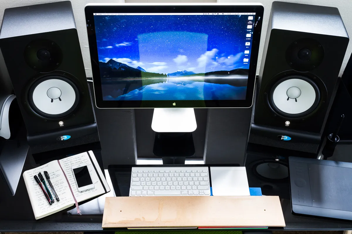
If I could change anything about my current setup, I definitely wouldn’t be working on a black glass desk. It is an incredible pain to keep clean. I’d like to try a sit-stand desk with a wood surface and motorized legs.
You have both an Embody and an Aeron in your space. Why did you choose them, and how do they differ for you?
I like them both, and they are very different. I typically start the work day in the Aeron because I love its forward tilt. It arches my back and keeps my body in attentive posture, which helps me kick-start productivity if I stayed up too late writing code or playing hockey. The Embody feels more relaxed to me, and I’m most comfortable in it slightly reclined. I usually tackle less intensive tasks in the Embody, like long-form reading or answering email. The Embody’s arm rests adjust closer to my body than the Aeron’s, which I find helpful in reducing shoulder strain.
It may seem excessive to have two high-end chairs in such close proximity, but an investment in design and comfort is easily justifiable to someone who spends as much time at a desk as I do.
